
In part one I discussed how I go about finding and downloading maps from the USGS Historic Topomap site. Now I will show how I go through the images I downloaded in Part 1 and determine which ones to keep to make a merged state map. I will also show some things you may run into while making such a map.
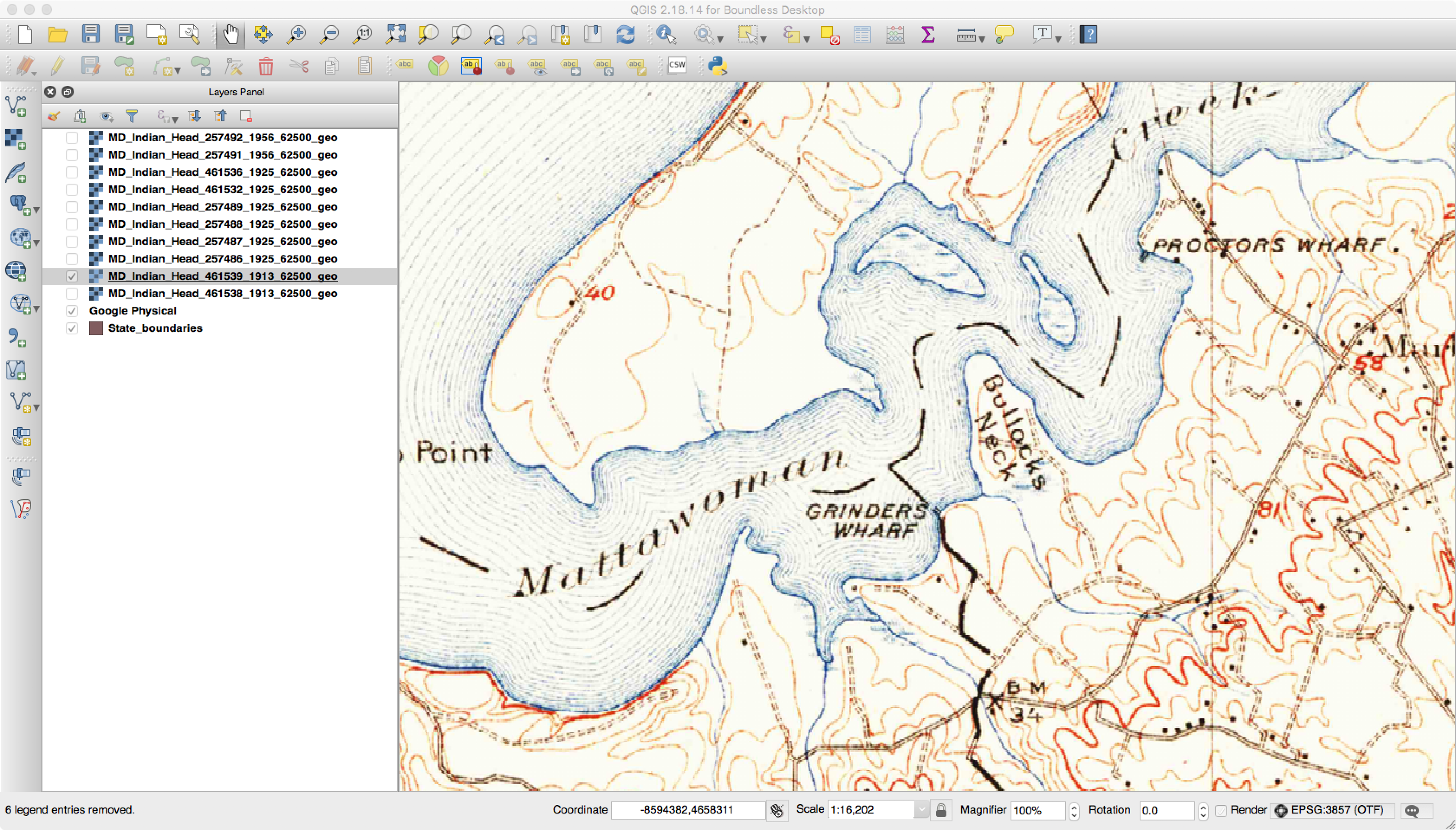
Now that the maps are all downloaded, it is time to go through and examine each one to determine what to keep and what to digitally “throw out.” When you download all the historic maps of a certain scale for a state, you will find that each geographic area may have multiple versions that cover it. You will also find that there are some specially made maps that go against the standard quadrangle area and naming convention. The easiest way for me to handle this is to load and examine all the maps inside QGIS.

Using QGIS to Check an Image
I load the maps that cover a quadrangle and overlay them on top of something like Google Maps. For my purposes, I usually try pick maps with the following characteristics:
- Oldest to cover an area.
- Good visual quality (easy to read, paper map does was not ripped, etc)
- Good georeferencing to existing features
QGIS makes it easy to look at all the maps that cover an area. I will typically change the opacity of a layer and see how features such as rivers match existing ones. You will be hard-pressed to find an exact match as some scales are too coarse and these old maps will never match the precision of modern digital ones made from GPS. I also make sure that the map is not too dark and that the text is easily readable.
One thing you will notice with the maps is that names change over time. An example of this is below, where in one map a feature is called Bullock’s Neck and in another it is Bullitt Neck.
Feature Named Bullock’s Neck

Feature Named Bullitt Neck
Another thing you will find with these maps is that the same features are not always in the same spots. Consider the next three images here that cover the same area.

Geographic Area to Check for Registration

First Historic Map to Check Registration

Second Map to Check Registration
If you look closely, you will see that the land features of the map seem to move down between the second and third images. This happens due to how the maps were printed “back in the day.” The maps were broken down into separates where each separate (or plate) contained features of the same color. One contained roads, text, and houses, while another had features such as forests. These separates had stud holes in them so they could be held in place during the printing process. Each separate was inked and a piece of paper was run over each one. Over time these stud holes would get worn so the one or more would move around during printing. Additionally, maps back then were somewhat “works of art,” and could differ between who did the inscribing. Finally, depending on scale and quality of the map, the algorithms to georeference the scanned images can result in rubber sheeting that can further change things.
During my processing, one of the things I use QGIS for is to check which maps register better against modern features. It takes a while using this method but in the end I am typically much happier about the final quality than if I just picked one from each batch at random.
Another thing to check with the historic maps is coverage. Sometimes the map may say it covers a part of the state when it does not.

Map Showing No Actual Virginia Coverage
Here the map showed up in the results list for Virginia, but you can see that the Virginia portion is blank and it actually only contains map information for Maryland.
Finally, you may well find that you do not have images that cover the entire state you are interested in. If you group things by scale and year, the USGS may no longer have the original topomaps for some areas. It could also be that no maps were actually produced for those areas.
Once the images are all selected, the images need to be merged into a single map for an individual state. For my setup I have found that things are easier and faster if I merge them into a GeoTIFF with multiple zoom layers as opposed to storing in PostGIS.
Here I will assume there is a directory of 250K scale files that cover Virginia and that these files have been sorted and the best selected. The first part of this is to merge the individual files into a single file with the command:
gdal_merge.py -o va_250k.tif *.tif
This command may take some time based on various factors. Once finished, the next part is to compress and tile the image. Tiling breaks the image into various parts that can be separately accessed and displayed without having to process the rest of the image. Compression can make a huge difference in file sizes. I did some experimenting and found that a JPEG compression quality of eighty strikes a good balance between being visually pleasing and reducing file size.
gdal_translate -co COMPRESS=JPEG -co TILED=YES -co JPEG_QUALITY=80 va_100k.tif va_100k_tiled.tif
Finally, GeoTIFFs can have reduced-resolution overview layers added to them. The TIFF format supports multiple pages in a file as one of the original uses was to store faxes. A GIS such as QGIS can recognize when a file has overlay views added and will use them first based on how far the user has zoomed. These views usually have much fewer data than the full file and can be quickly accessed and displayed.
gdaladdo --config COMPRESS_OVERVIEW JPEG --config INTERLEAVE_OVERVIEW PIXEL -r average va_100k_tiled.tif 2 4 8 16
With the above command, GDAL will add an overview that is roughly half sized, quarter sized, and so on.
In the end, with tiling and compression, my 250K scale merged map of Virginia comes in at 520 megabytes. QGIS recognizes that the multiple TIFF pages are the various overviews and over my home network loading and zooming is nearly instantaneous. Hopefully these posts will help you to create your own mosaics of historic or even more modern maps.